Case Study: The Clarion
Disclaimer: if you don’t like reading, then keep scrolling (but you’re missing out if you ask me).
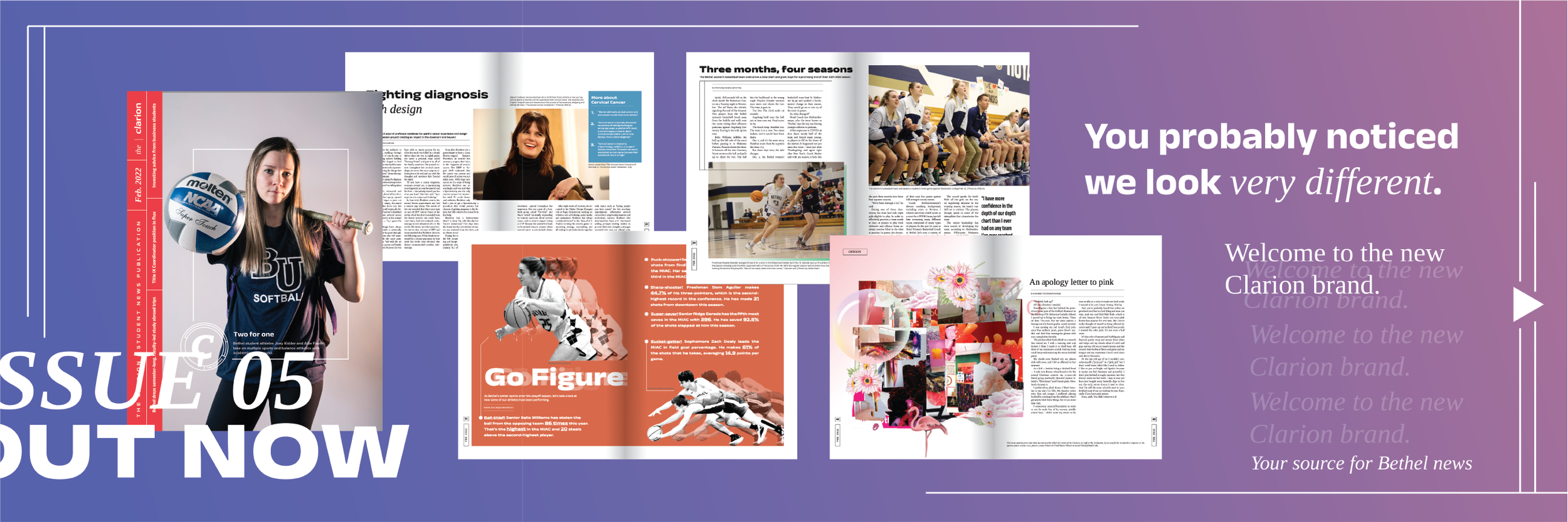
The Clarion is Bethel University's award-winning student-run news publication. Working on a monthly cycle, The Clarion reports on news in the Bethel community and greater St. Paul area. As the Art Director, I created and implemented a new brand system.
Why the Change?
1. The Brand:
The previous brand was sleek and rooted in an understanding of traditional news publications such as the New York Times, The Guardian, and others. This problem is that this is not representative of The Clarion. It did not acknowledge the strange energy that has always been a mark of The Clarion staff and the stories they write. Some publications would be hesitant to publish stories about the best spots to cry on campus, but not The Clarion.
2. The Designers:
Because of the nature of the publication being student-run, it was just as important to consider the staff that made The Clarion. A consistent message from the designers was a lack of understanding of the brand and a lack of excitement or freedom to experiment. Since the goal of the Clarion is to give students experience and a chance to learn, this was a major problem.
3. The Readers:
A consistent message received from readers is a praise of the quality of design The Clarion puts out. Rarely do readers comment on the contents of the story. This means two things. A) It is prudent to lean into our strong design staff as an asset. B) It is necessary to create techniques to encourage a potential consumer to read or skim a story.
The Identified Goals
1. Create a visual brand that accurately reflects the publication and its staff.
For this brand, I leaned on the following words to guide my process: approachable, bold, diverse, sensitive, and professional. This included creating a Mission statement, which had previously been overlooked.
2. Create a brand system that is flexible enough for designers to experiment with but clear enough for new designers to catch on easily.
I am honest about what our publication is: Student-run. The Clarion thrives as a place for designers and photographers to grow their skills and experiment. This visual brand aims to provide new designers and experienced designers the space to do just that without compromising a coherent and consistent visual style.
3. Implement techniques that catch the reader's attention and draw them into a story.
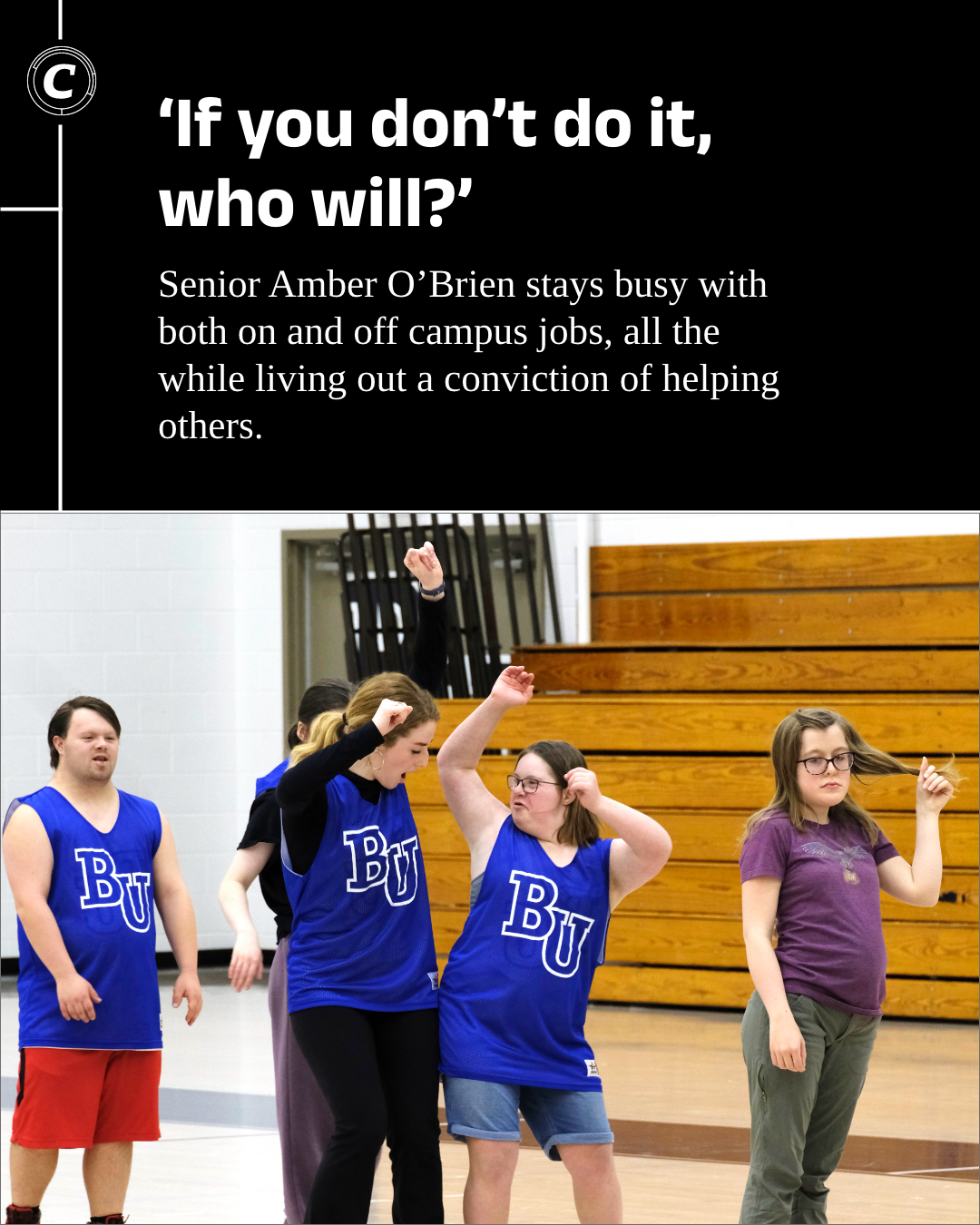
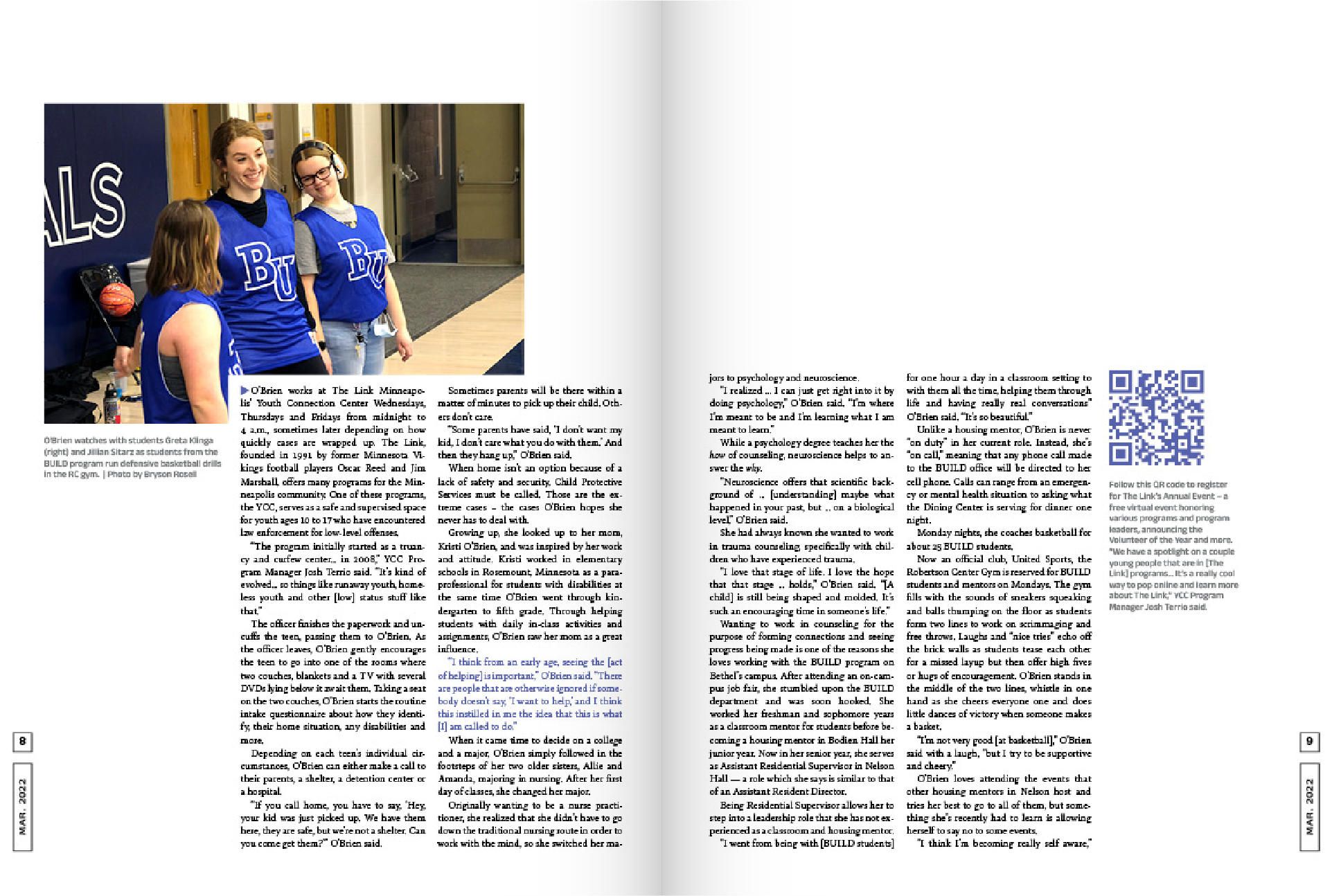
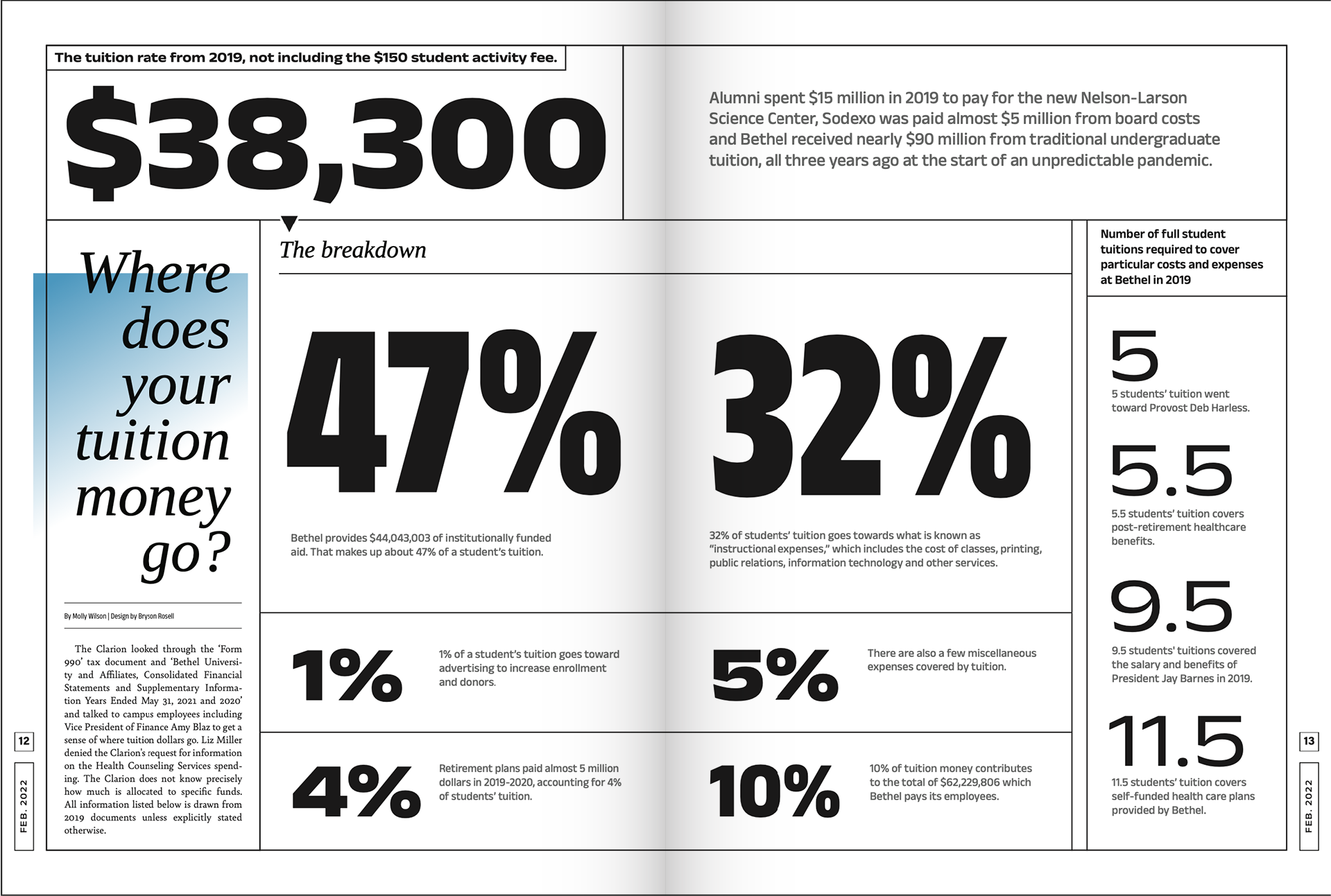
Pull quotes, highlighting text, and visual storytelling plays an important role in drawing the reader in. The new brand is a space to explore these and other techniques. Beginning stories with increased leading to separate it from the sea of dense text, using intricate infographics and more were explored and implemented in the new brand.
Mission Statement:
The Clarion is a student-led publication boldly seeking to communicate truth. We serve as a medium of storytelling to objectively share diverse perspectives to encourage dialogue within and outside of the Bethel community.
Slogans:
Truth Matters | Loud and Clear
Logo
Created from the combination of two typefaces, The Clarion's new logo leans forward just as The Clarion staff leans into hard stories in order to tell Truth. A lowercase word-mark showcases the desire to be approachable, and the twist of the "L" signifies the fun twist we bring to student news.
Typefaces
Colors
Colors were chosen to have flexibility. The Bright hues provide bold energy, but the addition of shades and the egg-white "#ffeed5" color provide the ability to ground the colors for stories that require a lighter touch. The key to the selection of the color palette is flexibility. It is necessary to scale them up and down in energy.
The individual colors rarely are used on the same spread together. Rare instances are subtle and intentional. For the most part, a designer picks a monochromatic color palette to work in for their individual story.
The Grid
The Clarion is designed exclusively on a 12-column grid structure due to its accessibility and flexibility. It is easier for a new designer to work with than other odd-numbered grid structures. The implementation of a baseline grid is used to keep text aligned consistently throughout the publication, no matter the designer.
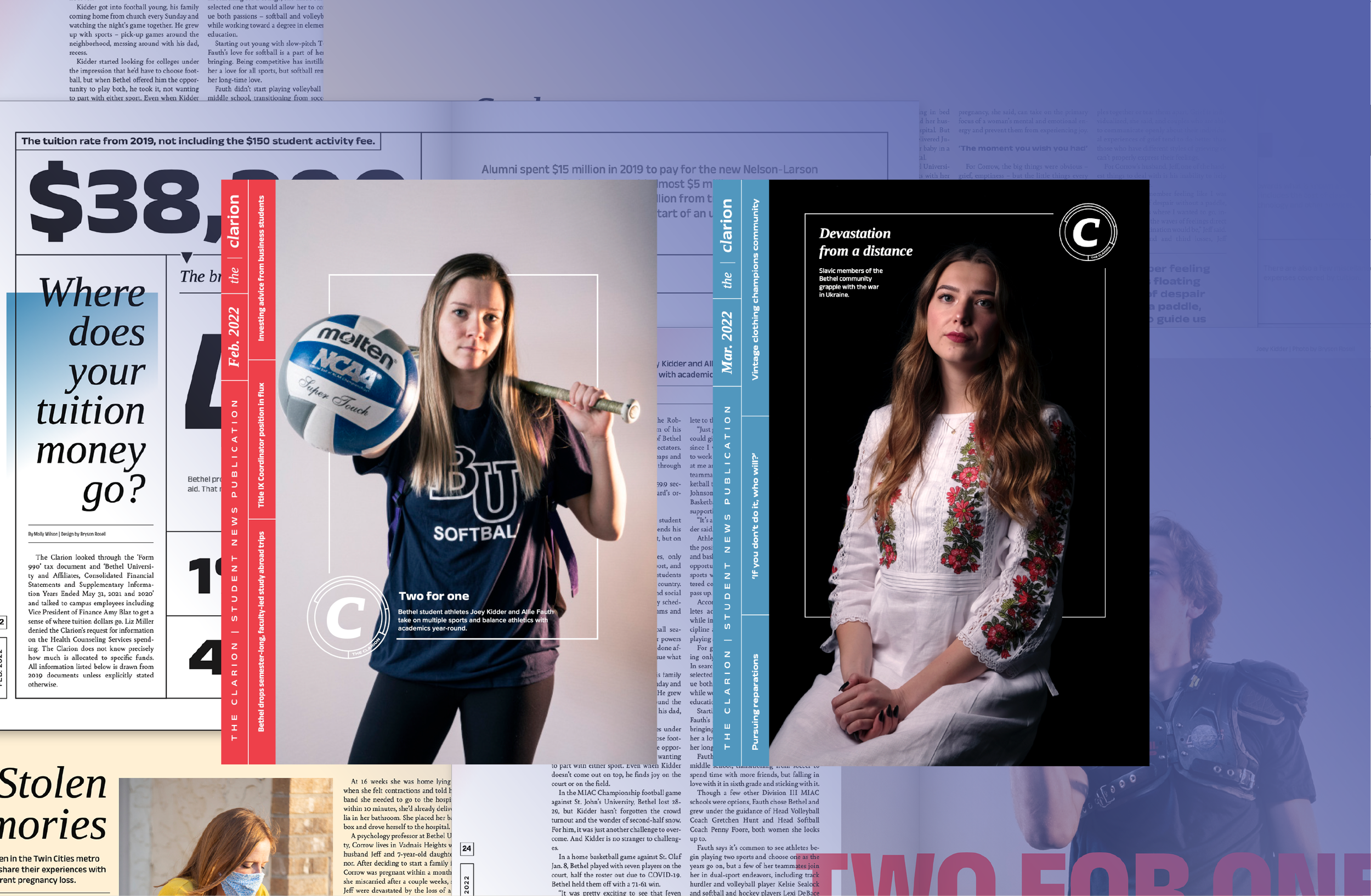
The Magazine





I oversaw the creation of 7 print editions as the Art Director.
A total of 336 pages.
Follow the links to see the full publication
