HM Music for Good
HM is a source for Heavy Metal news with a Christian twist. They discontinued their print magazine, but maintain a consistent online presence and have a dedicated following.
The project goal was simple: Rebrand HM.
Through extensive research, I sought to understand who HM targeted and what makes them different from the competition so that I could honor their mission and dedicated following.
For this reason, HM was rebranded to be UNORTHODOX and DIRECT, representing their dedicated Christian metal-head audience and their roots in the heavy music scene.
***********
Deliverables include: Logo, Website, Mobile App, Instagram Feed, Podcast designs and merchandise.
Logo design
The old Logo for HM is obvious but does not align with the tone and industry of the brand. There is a lost opportunity to lean into brand quirks and draw on historical symbols for inspiration.
The new Logo Maintains the H and M from the old logo but it adds new layers of complexity. It is based on a Black letter typeface as a subtle nod to gothic architecture and literature. It is balanced with consistent angles and negative space. The stylized nature of it is able to match the general aesthetic of the metal scene.
Proper Use of Logo
Improper Use of Logo

Brand Iconography
The HM brand requires various symbols, icons, and stylized images, all of which were drawn from religious symbols and iconography. This decision roots the brand even further in its religious background and connects it to the greater culture of metal music and the music scene’s historic use of gothic religious imagery.
Website
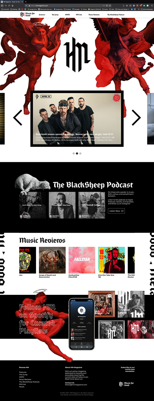
The landing page of HMmagazine.com is intended to hit home the visual brand. Scrolling down reveals multiple elements that direct the user to different sub-pages.
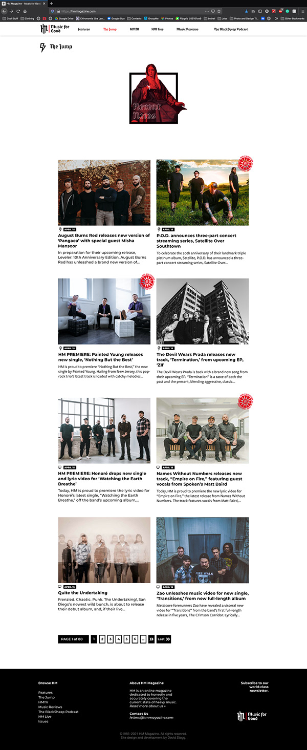
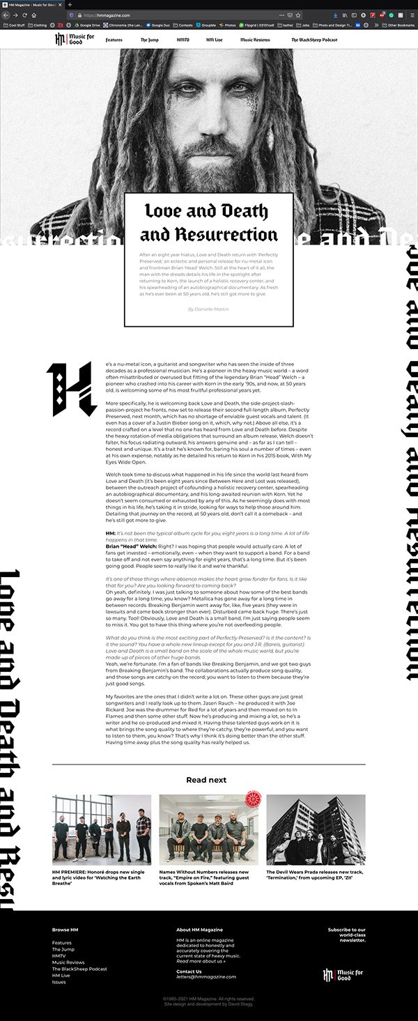
The rest of the site utilizes minimal stylizing so as to remain clean and legible. This site acts as the main hub for all things HM so it needs to be stylized but usable.
This site was prototyped in Adobe XD where a 12-column system is implemented across the entire website.


Mobile App
HM has not previously had a mobile app, but by putting one out they are able to provide more ease of access to their content. Most people have their phone on them at all times and will use it to distract themselves and the HM app will be there for them.
The app is prototyped in Adobe XD using a 12-column structure. It is roughly the same design as the website with a few tweaks for the sake of usability.


Social Media
The BlackSheep Podcast
The BlackSheep podcast is HM’s podcast where they discuss all things metal and Christianity. The original branding was well done so all that was updated was the logo and general series image.
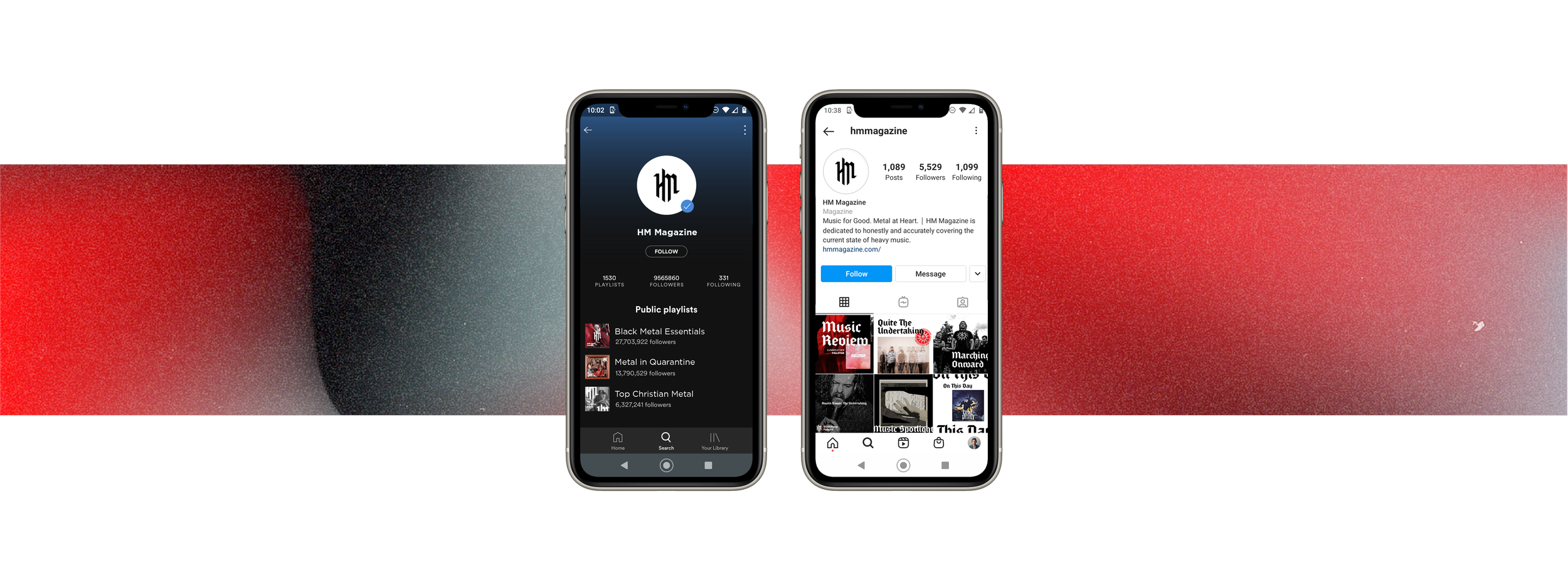
The HM Instagram serves as a launch pad for the app and website. It is also a location for quick updates. For this reason, the Instagram is less visuals heavy and more focused on the photos and individual albums covers that are being featured.


